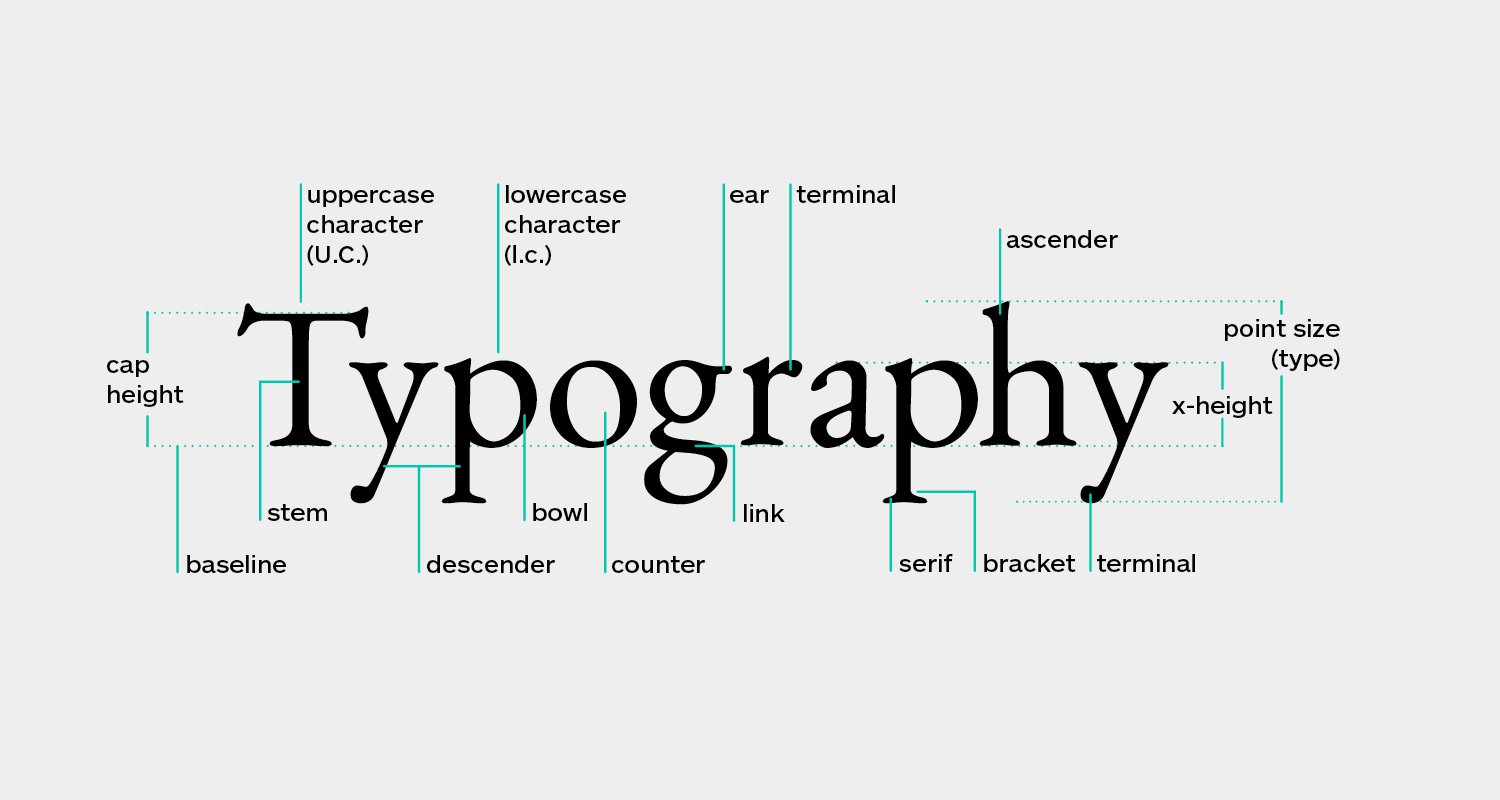
In today’s interconnected world, translation services are no longer limited to converting words from one language to another. Every detail, including fonts and typography, plays a crucial role in ensuring multilingual content is easy to read, culturally appropriate, and visually engaging. Whether you’re working on website localization, software interfaces, marketing campaigns, or technical manuals, typography can significantly influence how your message is understood across different languages.
Why Typography Matters in Multilingual Content
Different languages have unique writing systems, character widths, and reading patterns. A font that looks elegant in English may become difficult to read in Arabic, Chinese, Japanese, or Hindi. During the localization process, selecting fonts that support multiple scripts ensures that translated content remains consistent and accessible.
For example, German translations often require additional space due to longer compound words, while Chinese and Japanese rely on complex characters that demand higher clarity. Similarly, right-to-left languages such as Arabic require typography that naturally supports their reading direction.
Choosing the Right Font for Translation Projects
When preparing multilingual content, translators and localization specialists should consider fonts that provide broad Unicode support. Popular options like Noto Sans, Arial Unicode MS, and Source Sans are widely used because they display characters accurately across numerous languages.
Beyond technical compatibility, readability is equally important. Appropriate font size, spacing, and line height help readers process information effortlessly, especially in technical translation, medical translation, and legal documentation where precision is essential.
Typography and User Experience
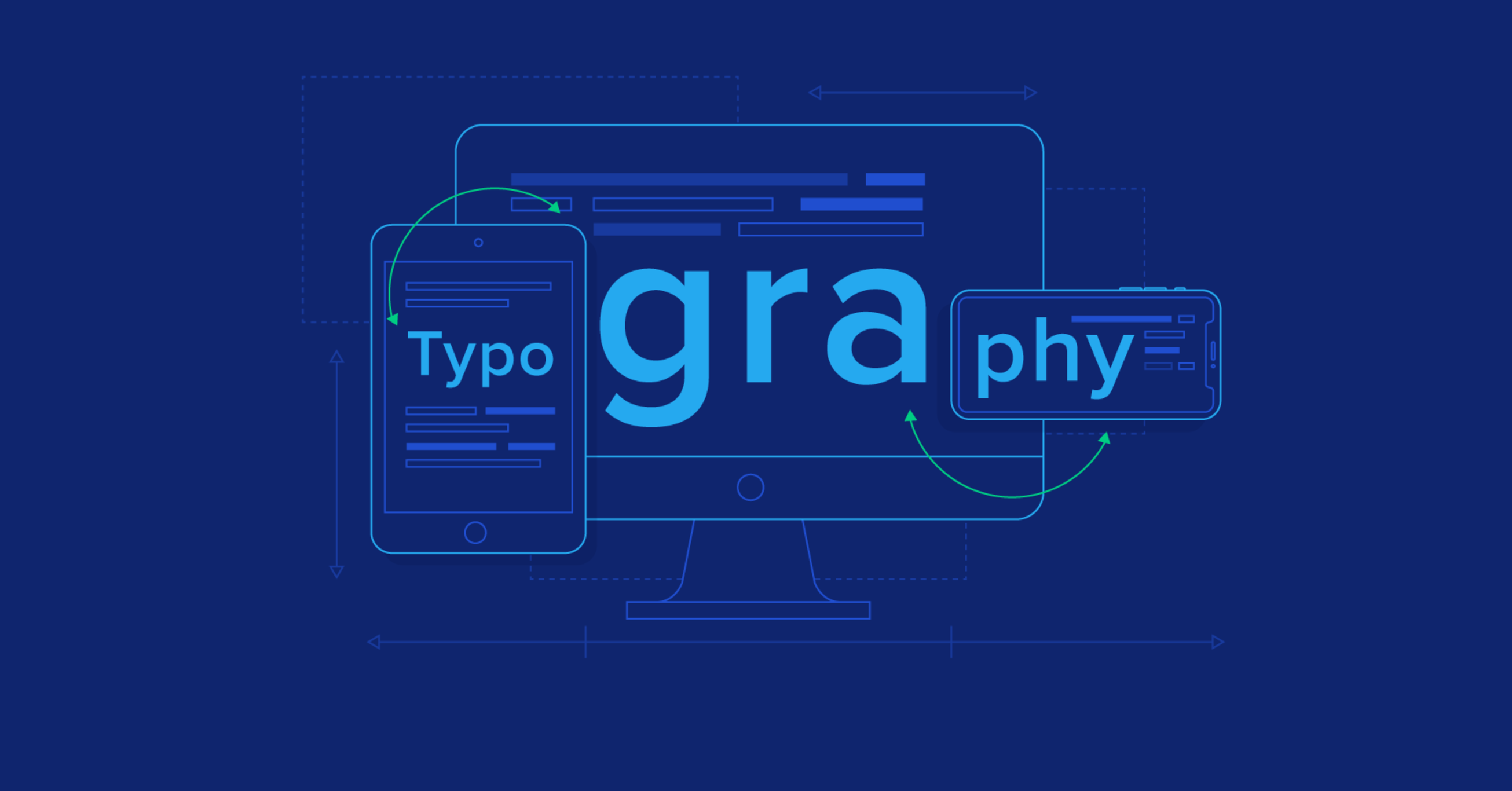
Typography directly affects the user experience of localizedwebsites and applications. Poor font choices can lead to clipped text, overlapping characters, or inconsistent formatting, making even high-quality translations appear unprofessional.
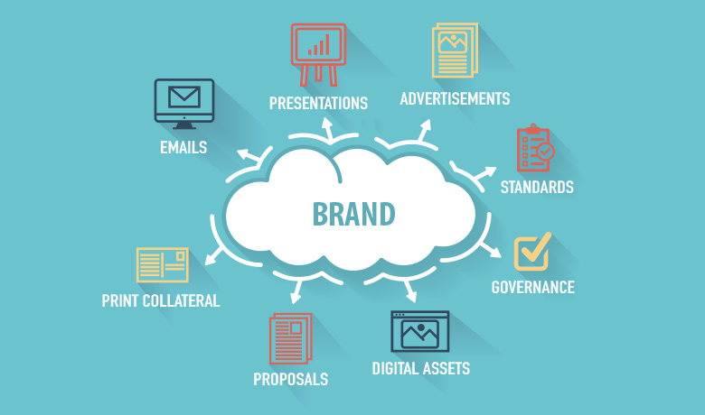
Professional language service providers (LSPs) often combine translation, desktop publishing (DTP), and localization to ensure every translated document maintains both linguistic accuracy and visual appeal. This integrated approach strengthens brand identity while improving customer engagement across global markets

Best Practices for Better Multilingual Readability
To improve multilingual readability, consider these simple guidelines:
• Choose Unicode-compatible fonts with extensive language support.
• Test translations in every target language before publication.
• Allow flexible layouts for text expansion during localization.
• Maintain proper spacing, alignment, and contrast for readability.
• Collaborate with experienced translation and localization experts who understand typography requirements for different scripts.
Final Thoughts
Successful multilingual communication depends on more than accurate translation. Fonts and typography shape how readers perceive, understand, and trust your content. By investing in thoughtful typography alongside professional translation, localization, DTP, and multilingual content services, businesses can deliver a seamless reading experience that resonates with audiences worldwide. The right visual presentation not only improves readability but also reinforces your brand’s credibility in every language.
 Gaming Computer
1 × $940.00
Gaming Computer
1 × $940.00
 Smartphone Vivo
V9 1 × $899.00
Smartphone Vivo
V9 1 × $899.00 SanDisk Flash
Drive 1 × $756.00
SanDisk Flash
Drive 1 × $756.00 Smart Power Bank
1 × $723.00
Smart Power Bank
1 × $723.00
 Apple Smartwatch
1 × $1080.00
Apple Smartwatch
1 × $1080.00